Creating a Frontend
After successfully authenticating the GoMeddo Frontend Builder, you can create and configure a frontend that defines how users book or sign up for Reservations.
Frontend Modes
When creating a frontend, you choose a mode, which determines the type of journey you are building:
|
Mode |
Description |
|---|---|
|
Reservation mode |
Users create a new Reservation by selecting resources, time slots, and other details. |
|
Sign-Up mode |
Users sign up for existing Reservations that have already been created. |
The selected mode controls:
-
Which steps are available
-
How availability and conflict checking are handled
-
How Reservations are created or joined
Steps
-
Navigate to GoMeddo Settings and open Frontend Builder.
-
Click Add Frontend.
-
A new frontend is created. Clicking on it opens the frontend configuration page, where you can:
-
Configure the customer journey
-
Define which steps are shown to users
-
Customize the look and feel of the frontend
-
Reservation Blueprints
The Frontend Builder is built around Reservation Blueprints, which define the structure of the Reservation that will be created.
A Blueprint determines:
-
Which Dimension(s) are booked (for example, rooms, staff, or equipment)
-
The duration of the Reservation
-
Default values and additional configuration
In practice, a Blueprint represents the type of appointment the customer is making.
More information on Blueprints can be found here: Reservation Blueprints
Styling
You can configure the appearance of your frontend so it visually integrates with the website on which it is embedded. GoMeddo provides a wide range of color options to help you match your brand identity.
Configuration Example
Result
Color Usage
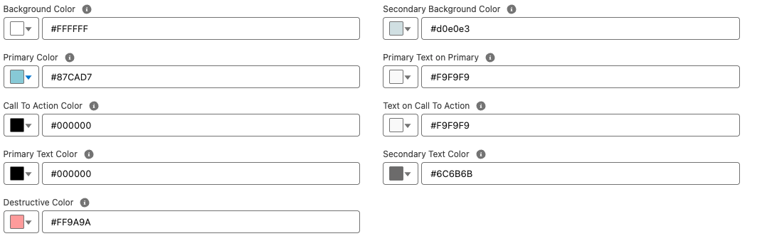
The table below describes how each configurable color is used within the frontend UI.
|
Color |
Explanation |
|---|---|
|
Background Color |
The main background color of the user interface. |
|
Primary Color |
The primary brand color used for key interactive elements such as links, toggles, and highlights. |
|
Call To Action Color |
Used to highlight key actions, such as Next, Submit, and Pay buttons. |
|
Primary Text Color |
The main text color used throughout the UI. |
|
Destructive Color |
Used for error states, such as input validation messages. |
|
Secondary Background Color |
Used for secondary surfaces, such as selection cards. |
|
Primary Text on Primary |
Text color displayed on top of primary-colored backgrounds. |
|
Text on Call To Action |
Text and icon color displayed on call-to-action buttons. |
|
Secondary Text Color |
Used for supporting or less prominent text, such as hints or descriptions. |
This configuration allows you to fully customize the look and feel of the frontend while maintaining clarity, accessibility, and brand consistency.