This step allows the user to select Dimension records that will be attached to the Reservation.
A common example is selecting a Staff member to associate with the Reservation alongside a user-selected Resource.
Step Configuration
Depending on the configuration of the selected Dimension, you may be able to store the selected value using:
-
a Dimension Field
-
a Dimension Junction
If both options are available, you can switch between them using the Use Dimension Field / Use Dimension Junction button.
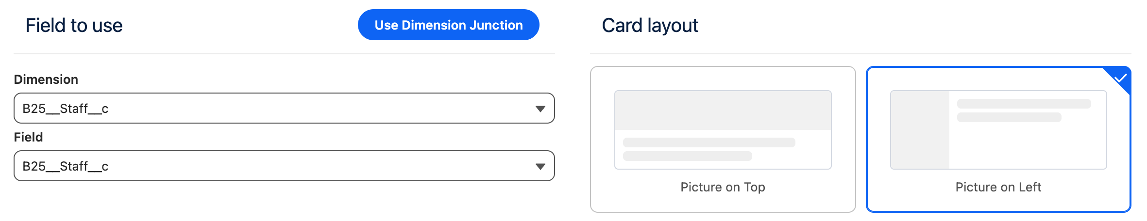
Field to use
This section allows you to:
-
Select the Dimension for which records should be shown to the user
-
Select the field on the Reservation where the selected Dimension record will be stored
Only supports the selection of a single record.
Only Dimensions for which a Field To Set has been configured on at least one Blueprint will be available for selection. Learn more about configuring Blueprints.
Junction to use
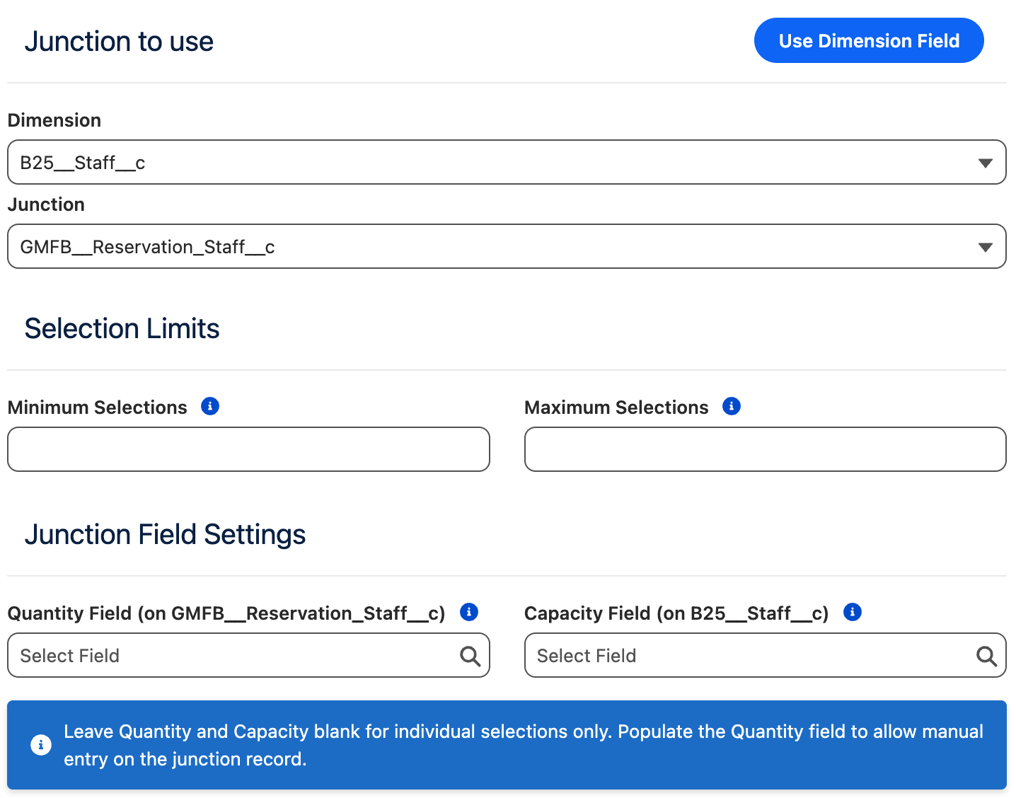
This section allows you to:
-
Select the Dimension for which records should be shown to the user
-
Select the Junction that will be used to link the selected Dimension and the Reservation based on the user’s choice.
Junctions allow the user to select zero, one, or multiple records. As well as specifying the quantity on the Junction record if configured.
Only Dimensions for which a Related To Set and it’s underlying Field To Set has been configured on at least one Blueprint will be available for selection. Learn more about configuring Blueprints.
Selection Limits
This section is available only when using Junctions and allows you to define selection constraints for the user.
|
Setting |
Description |
|---|---|
|
Minimum Selections |
Defines the minimum number of records the user must select.
|
|
Maximum Selections |
Defines the maximum number of records the user can select.
|
Junction Field Settings
This section is available only when using Junctions and allows you to configure field mappings on the Junction record that are populated based on the user's input.
|
Setting |
Description |
|---|---|
|
Quantity Field |
Specifies the field on the Junction record where the user-entered quantity will be stored. When configured, users will be prompted to enter a quantity for each selected Dimension record. If left empty, the quantity selector will not be shown. |
|
Capacity Field |
Specifies a field on the Dimension record that defines its maximum capacity. When configured, this value caps the maximum quantity a user can enter for that individual record. If left empty, the user can enter any quantity without limit. |
Record sorting
This section allows you to choose how the records presented to the user for selection will be sorted.
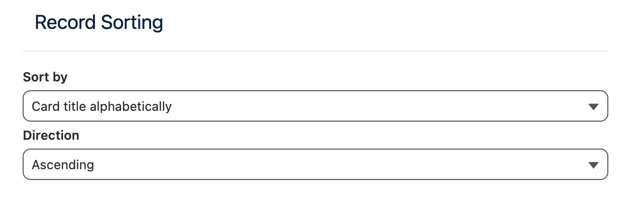
The sorting options are:
|
Option |
Description |
|---|---|
|
Alphabetically |
Will sort the records alphabetically based on the Card Title (or record name is card title is not used). The direction can either be ascending or descending. |
|
Field value |
Will sort the records based on the value of a selected field. The direction can either be ascending or descending. |
|
Ranking rules |
Will sort the records based on the ranking rules for this Dimension. |
Behavior Depending on Step Position
The behavior of the Dimension Selection step depends on whether it is placed before or after the Timeslot Selection step in the customer journey.
This distinction allows you to control whether Dimension availability should constrain time slot visibility or be resolved after time slot selection, depending on your booking logic and user experience requirements.
Dimension Selection Before Timeslot Selection
When the Dimension Selection step is placed before the Timeslot Selection step:
-
The user-selected Dimension record(s) are included in the conflict checking performed during time slot retrieval.
-
Time slots are shown only if they are compatible with:
-
the selected Resource,
-
the selected Dimension record(s), and
-
any additional user inputs (for example from the Custom Fields or Personal Information steps),
depending on how Conflict Rules are configured in Salesforce.
-
This ensures that users only see time slots that are valid for the full set of inputs provided up to that point in the customer journey.
For this behavior to work correctly, Multi-Dimensional Availability (MDA) must be configured properly in Salesforce.
Dimension Selection After Timeslot Selection
When the Dimension Selection step is placed after the Timeslot Selection step:
-
Time slots are retrieved based on the Resource availability only.
-
Each time slot may represent multiple possible reservation permutations, depending on the availability of Dimension records.
-
The user’s Dimension selection is then used to filter these permutations until a valid reservation configuration is determined.
In this scenario, Dimension availability does not restrict which time slots are initially shown, but instead affects which reservation is ultimately created for the selected time slot.
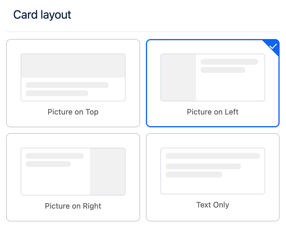
Layout Configuration
Card Layout
Steps that are based on user selection such as Blueprint Selection, Parent Resource Selection and Dimension Selection support customization of the card layout.
The card layout defines how selection cards are displayed to the user, enabling you to adjust their structure and presentation to better match your design requirements.
Card Data Fields
You can configure which Salesforce fields are used to populate the content displayed on selection cards. This allows you to control exactly which information is presented to the user for each selectable item.
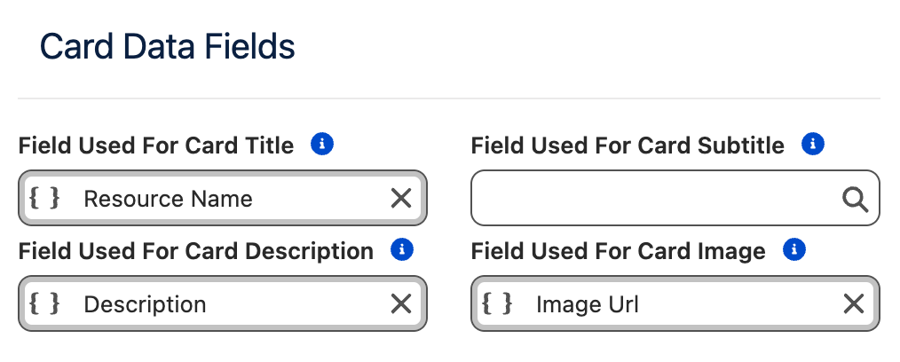
|
Card Element |
Purpose |
|---|---|
|
Title |
The main title displayed on the card. |
|
Subtitle |
Secondary text displayed between the title and the description. |
|
Description |
Descriptive text shown on the card. |
|
Image |
A URL pointing to an image that will be displayed on the card. |
If no field is specified for a Card Element, that element will not be rendered on the card.
Images are an exception: if no image field is configured, an empty image placeholder will be displayed. If you do not intend to display images on selection cards, it is recommended to use the Text Only layout to avoid empty placeholders.
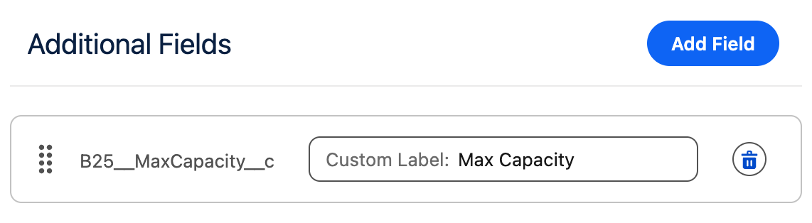
Additional Fields
In addition to the main card elements, you can configure additional fields to be displayed below the card description.
-
Each additional field is rendered on its own line.
-
The label associated with each additional field can be customized.
This allows you to add extra contextual information without overcrowding the main card content.
Card Settings
This section allows you to customize the size of the cards and their individual elements.
|
Setting |
Purpose |
|---|---|
|
Max Image Width |
The maximum width the image can occupy within the card. |
|
Cards Per Row |
The maximum number of cards displayed in a single row. |
|
Min Card Width |
The minimum width a card is allowed to have. |
Responsive Behavior
The Cards Per Row and Min Card Width settings are closely related. The Frontend Builder uses a fully responsive layout to ensure content is displayed clearly and elegantly across all screen sizes and container widths.
If there is not enough horizontal space to meet both constraints, the system will automatically reduce the number of cards per row.
On mobile devices, the layout automatically switches to Picture on Top to ensure an optimal viewing and interaction experience.
Example:
-
Cards Per Row:
2 -
Min Card Width:
700px -
Available container width:
1000px
In this case, only one card per row will be displayed, as two cards with a minimum width of 700px cannot fit side by side within the available space. To display two cards per row, either the container width must be increased or the Min Card Width must be reduced.
Max Image Width Guidelines
The Max Image Width setting controls how much horizontal space the image occupies within the card.
-
The value cannot exceed the configured Min Card Width.
-
Choose a width that leaves enough space for textual content, so the card does not appear visually constrained.
-
This setting also indirectly controls the image aspect ratio:
-
Smaller widths are better suited for portrait images.
-
Larger widths are better suited for landscape images.
-