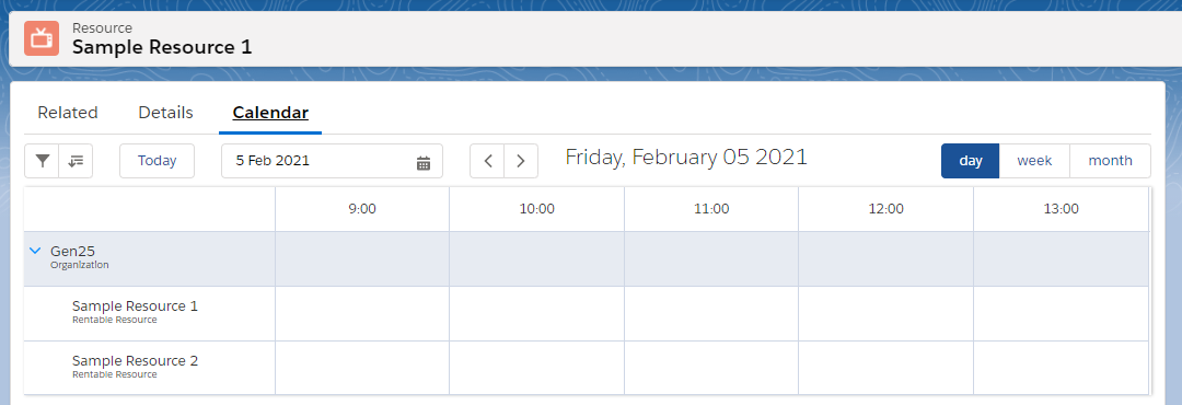
Displays a horizontal calendar, with times and dates on the horizontal axis as column headers, and dimension records on the vertical axis as row headers.
This component is available for app pages and record pages. If you include this in an Experience Cloud, make sure it is on a record page. See this article for more information on how to Add a Calendar to a page.

General Properties
No matter what page the component is added to, the following properties are always available:
|
Property |
Required |
Description |
|---|---|---|
|
Calendar |
Yes |
The component will take its configuration from the selected calendar record. Only calendars of record type |
|
Max Height |
Yes |
The maximum height of the calendar in pixels. |
|
Max height’s unit |
Yes |
If the max height property should be interpreted in pixels or as a percentage. |
|
Filter identifier |
No |
Calendars with the same identifier share their filters. When empty, defaults to the name of the selected calendar. |
Additional Record Page Properties
When added to a record page, the following additional properties are available:
|
Property |
Required |
Description |
|---|---|---|
|
Lookup to Dimension |
No |
A lookup on the record that points towards the dimension you want to display. More info below. |
|
Child Dimensions to Display |
No |
A related list which contains dimensions you want to display. More info below. |
|
Availability Filtering |
No |
If checked, records that are not available will be hidden. If you are using multi-dimensional availabilities, the record that this component is on will be used to determine availability. |
Additional Experience Cloud Properties
If you include this in an Experience Cloud, make sure it is on a record page.
When added to an Experience Cloud, the following additional properties are available:
|
Property |
Required |
Description |
|---|---|---|
|
Record ID |
Yes |
The id of the record the component is located on. Enter |
|
Object Name |
Yes |
The object name of the current record. Enter |
Controlling what the calendar displays
On an App Page:
The component will display the reservations for every record (that the user has access to) of the linked dimension. So for example when a Resource calendar has been selected, the component will display every Resource in your org.
If you have a use case to only display reservations for specific records, or are running into limits because the component is trying to display too many records, you can wrap the component and pass it the ids of the dimension records you want to display reservations for. See Wrapping Calendar Components - Aura
On a Record Page:
You can use the two inputs Lookup to Dimension and Child Dimensions to Display to control what the calendar displays.
If both these inputs are empty, the calendar component will display all records belonging to the dimension of the selected calendar. This means that if the Staff calendar is selected, the component will display all Staff records that the user has access to.
If Lookup to Dimension is filled in on the component, the component will display the related record contained in that lookup. So for example if you place this component on a record page with a ‘Resource’ lookup, the calendar will display the resource that the current record is related to. If that happens to be a parent resource, such as a building with multiple meeting rooms, all those child meeting rooms will also be displayed.
Child Dimensions to Display is very similar to Lookup to Dimension, except instead of a related parent record, it lets you choose a list of child records to display. For example, if a custom object ‘Store’ has a lookup ‘Manager’, you can select the ‘Stores’ child list to display all the stores that a manager is related to.
Record Access and Filters
Records that the user does not have access to because of sharing rules, will never be displayed.
The user can narrow down which of the available records are being displayed by using the filter options on the calendar. As an admin you can control which filter options are available to users, described here: Calendar Filters.
If you want to narrow down even further which records are available for display, you can wrap the component inside your own, and pass your own filters to the component, explained here: Wrapping Calendar Components - Aura.