You can define what your calendars look like, by configuring Calendar records and linking them to Views using the Calendar Views related list. This article details the configuration options for these objects.
Some fields might not be visible in your org, because they have not been added to the page layout. If you’re not sure how to add fields to a page layout, check out this trailhead module.
Setting up a view
As seen in the video, setting up a view for our calendar requires the following steps:
-
Go to Calendars
-
Select the calendar you want to add a view to (in our case Resources)
-
Go to Related tab
-
Go to Calendar Views
-
Click New
-
Select one of the packaged views (or create a new) for day view, (optionally) make it default and make it the first button
-
Save
-
Go back to your Resource Calendar and refresh the page
-
Day view is now available
Dynamic grouping fields
-
Select the basis of the grouping (in our example Account)
-
Go to Calendars
-
Go to the Calendar where you are planning on making the grouping (in our example Contacts)
-
Go to Related tab
-
Go to Dynamic grouping fields
-
Click New
-
Fill in the Dynamic Grouping Field Name field with the basis of the grouping that you defined prior (in our example AccountId)
-
Select Default
-
Save
-
Go back to your Calendar and refresh the page
-
Grouping is now active
Calendars
This object defines what information is shown on a reservation on the calendar.
|
Field |
Description |
|---|---|
|
Calendar Name |
The name of the calendar record that allows you to recognise it |
|
Dimension |
The Dimension plotted on this calendar |
|
Default Background Color |
The background color for reservation that have no Reservation Colors defined for them. |
|
Default Text Color |
The text color for reservation that have no Reservation Colors defined for them. |
|
Default Border Color |
The border color for reservation that have no Reservation Colors defined for them. |
|
Prevent Horizontal Drag |
Prevent users from dragging reservations to a new time on the same resource. You can still change the resource. Currently only supported on multi-calendars |
|
Prevent Vertical Drag |
Prevent users from dragging reservations to a resource. You can still change the reservation's time. Currently only supported on multi calendars. |
|
Show Unlinked Reservation Types |
When checked, reservations of types not linked to the Calendar will also be visible on the calendar. For linking Reservation Types to Calendars see: Reservation Types |
|
Display In User Timezone |
Enabling this setting will display reservations at the time they occur for the user viewing the calendar, instead of the local time. |
|
Group Overlapping Reservations |
If more than this number of reservations overlap on the calendar, they will be grouped into a single block that can be expanded. |
|
Load Availabilities Based On View |
When enabled the calendar will load and process availabilities based on the time range in view. If disabled the calendar will load all availabilities. |
|
Enable Multi Selection |
When enabled this feature allows for selecting multiple resources. To select a range, hold SHIFT and drag, or to select multiple resources individually, hold CTRL/CMD and click. To specify what happens when multiple selections are made see Multi Selection Type. |
|
Multi Selection Type |
Specifies what happens when multiple selections are made.
|
|
First Day Of Week |
Allows to choose a custom day as the first day of the week. Select Locale (or None) to use the user’s first day of the week. Selecting a day of the week will override the first day of the week for the specific calendar regardless of the user’s locale. |
|
Hide Diagonal Lines for MDAs |
By default, the cells on a calendar will display diagonal lines if there is a multi-dimensional availability for that record. Enabling this setting will hide the diagonal lines on that calendar. |
|
Collapse Resources By Default |
When enabled the resource on the multi-calendar will be collapsed on the first load of the calendar. When disabled, all resources and children will be in expanded state. |
Calendar related lists
Calendars have the following related lists:
|
Related List |
Description |
|---|---|
|
Resource Titles |
Resource Titles let you show information on each resource (or other dimension) on the calendar: Show fields on calendar resources |
|
Calendar Views |
Calendar Views link views to calendars, making them available to your users. See the Calendar Views section below. |
|
Filterable Fields |
Filterable Fields let you predefine which filters apply to the resources (or other dimensions) being shown on the VisualForce multi-calendar. More info can be found here: Configure Filterable Fields Note that the new Lightning calendars have a different way to define filters, as described here: Calendar Filters |
|
Reservation Colors |
Reservation Colors let you define the appearance of reservations based on their status or type: Reservation Colors |
|
Reservation Display Contexts |
Reservation Display Contexts define which fields to show on reservations and their hover popups. More info here: Customise the Reservation fields shown on the calendar and hovers Note that ‘Calendar’ is an optional lookup for Reservation Display Contexts. so it is normal for this related list to be empty. |
|
Calendar Reservation Types |
Calendar Reservation Types make reservations of specific types visible on a calendar. These records are created automatically when you create a new Calendar or Reservation Type. For more info: Reservation Types |
|
Dynamic Grouping Fields |
Dynamic Grouping Fields let you display a hierarchical structure for the resources (or other dimensions) being displayed on the calendar. For more info: Dynamic Dimension Grouping |
Calendar Record Types
The Calendar object has the following record types:
|
Record Type |
API Name |
Corresponding Page Layout |
Description |
|---|---|---|---|
|
Multi Resource Calendar |
Multi_Resource_Calendar |
Multi Resource Calendar Layout |
Configures a calendar showing multiple resources (or other dimensions). |
|
Single Resource Calendar |
Single_Resource_Calendar |
Single Resource Calendar Layout |
Configures a calendar showing one resource (or other dimension). |
|
Schedule Calendar |
Schedule_Calendar |
Schedule Calendar Layout |
Configures a schedule calendar. More info: Scheduler |
Views
This object defines what a calendar looks like. For example: you can define the length of slots, the drag interval of reservations on the calendar and how long a view takes (a day, 2 days, a week, etc..)
|
Field |
Description |
|---|---|
|
View Name |
The name of the record in Salesforce. |
|
Label |
The button text to display on the calendar. |
|
Slot Duration |
The time interval between each vertical line. Examples: 00:05 = 5 minutes, 24:00 = one day, 7.00:00 = one week. |
|
Snap Duration |
The time interval when dragging an existing reservation on the calendar. Examples: 00:05 = 5 minutes. |
|
Slot Label Format |
The text that is displayed in the label of each time column. You can use the following formats: Date & Time Format Tokens |
|
Slot Width |
The width of each cell in pixels. |
|
View Duration |
The duration of the view. Examples: 24:00 = one day, 7.00:00 = one week, 30.00:00 = one month. Special values: Year, Month, Week, Workweek. |
|
Weekend Highlight Color |
Enter a hexadecimal or CSS color code to highlight weekends. Leave blank for no highlighting. |
|
Unique Identifier |
Used to uniquely identify this view, even if it has the same label as another view. May not contain special characters, and may not start with a number. |
|
Hide Closed Times Without Reservations |
This setting has been deprecated and replaced by the Column Hiding Behavior picklist. |
|
Column Hiding Behavior |
This picklist controls which columns to hide. See Column Hiding Behavior for all the options. |
|
Expand Events To Fill Cell |
If this is checked, events shorter than a cell will be expanded to fill the entire cell. These events will get a duration bar to indicate their actual times. |
|
Hide Duration Bar |
When using the settings “Expand Events To Fill Cell”, you can use this setting to hide the duration bar which indicates the actual duration of the reservation. |
|
Enable Subcell Availability Rendering |
When enabled, cells that are only partially available will have their unavailable parts grayed out. Consider disabling this feature for performance reasons if your calendar displays a lot of cells. |
|
Enable Availability Aware Selection |
When enabled, and the user selects a cell to create a new Reservation, only the available part of the cell will be selected. |
|
Time Range Format |
The format for the time range at the top of the calendar. It is possible to specify formats for the start and end date of the calendar. Using start{<formatting tokens>} and end{<formatting tokens>} for the formatting tokens use moment.js formatting tokens (http://momentjs.com/docs/#/displaying/format/ ). example: start{ddd MMM DD} - end{ddd MMM DD, YYYY} would result in Sat Sep 01 - Mon Oct 01, 2018 |
|
Reservation Overlap |
Allows reservations to overlap on the calendar. Accepts a percentage value. By default set to 0, meaning reservations occupy the full height without overlapping. Using a higher percentage will create partial overlaps. Negative percentages will add space between reservations. |
|
Hide Current Time Indicator |
Allows you to hide the red line indicating the current time. On the multi calendar you can then use the time headers to highlight the current time there instead. |
|
Disable Progressive Event Rendering |
Disables rendering the reservations when scrolling, this allows you to render them all up front, improves scrolling behaviour but has an impact on performance. |
|
Draw Blank Cells |
(Performance tweaks) When disabled fully white cells are no longer drawn. Visually this makes no difference and improves performance. But certain assistive technologies will not work properly. |
|
Cell Draw Delay |
(Performance tweaks) The delay in milliseconds before cells are redrawn while scrolling. Increasing this reduces rendering work during fast scrolling, but cells appear later. For instant cell rendering leave this empty or at 0. For smooth scrolling on really large views but delayed cell drawing set this to 200-300. |
Column Hiding Behaviour
You can use the Column Hiding Behavior picklist on View to control which columns are hidden on the calendar for that view.
Unavailabilities that fall within an availability window are currently not taken into account when determining whether a column should be hidden. For example, if a resource has an availability from 10:00 to 16:00 and an unavailability from 12:00 to 13:00, the 12:00–13:00 columns will remain visible even though the resource is unavailable during that time.
|
Value |
Description |
|---|---|
|
Don’t hide anything |
No columns are hidden. |
|
Hide closed times |
Hide any columns where all of the rows are closed. |
|
Hide closed times without reservations |
Same as above, but if a column has a reservation don’t hide it. |
|
Hide times outside of start/end |
If the view has start/end times, hide all columns outside of those times. |
|
Hide times outside of start/end, without reservations |
Same as above, but if a column has a reservation don’t hide it. |
|
Hide all times without reservations |
Hide all columns, except the ones that have a reservation. |
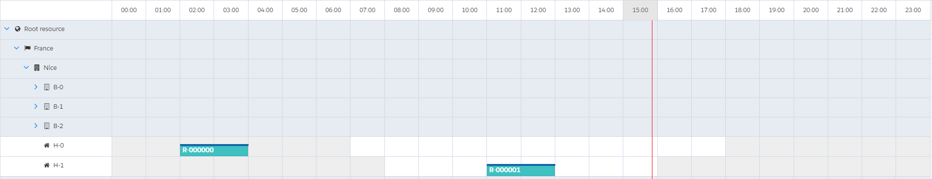
Don’t hide anything
No columns are hidden. Notice that the view shows the full day from 00:00 until 24:00.
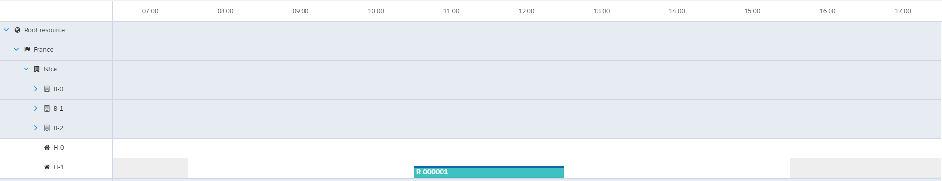
Hide closed times
Hide any columns where all of the rows are closed. The view now starts at 07:00 (when the first resource opens) and ends at 18:00 (when the last resource closes).
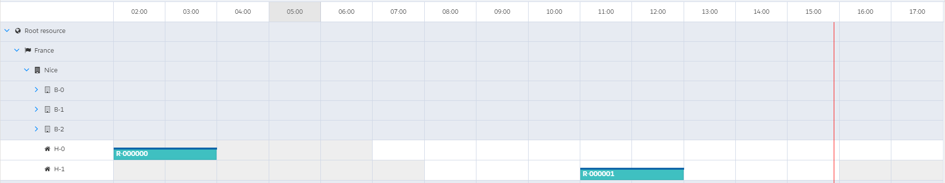
Hide closed times without reservations
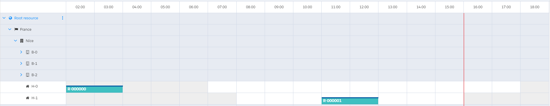
Same as above, but if a column has a reservation don’t hide it. Notice that the view now starts at 02:00 to include the reservation taking place while the resource is closed.
Hide times outside of start/end
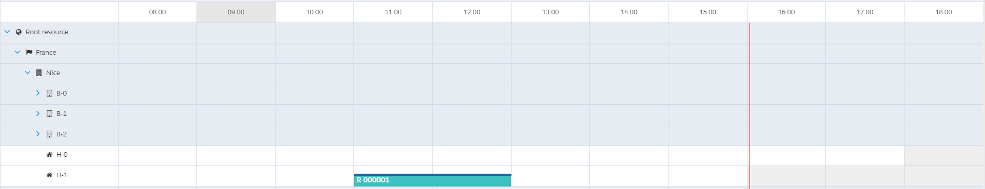
If the view has start/end times, hide all columns outside of those times. In the example below, the start time has been set to 08:00 and the end time to 19:00. Notice that the column from 18:00 until 19:00 is shown even though all resources are closed.
Hide times outside of start/end, without reservations
Same as above, but if a column has a reservation don’t hide it. Notice that the view now starts at 02:00 to include the reservation taking place while the resource is closed.
Hide all times without reservations
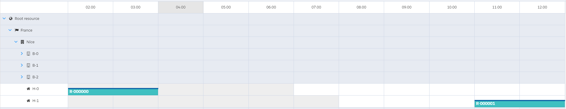
Hide all columns, except the ones that have a reservation. Notice that the view starts at 02:00 (when the first reservation starts) and ends at 13:00 (when the last reservation ends).
View related lists
Views have the following related lists:
|
Related List |
Description |
|---|---|
|
Calendar Views |
Calendar Views link views to calendars, making them available to your users. See the Calendar Views section below. |
|
Displays |
Reservation Display Contexts define which fields to show on reservations and their hover popups. More info here: Customise the Reservation fields shown on the calendar and hovers Note that ‘View’ is an optional lookup for Reservation Display Contexts. so it is normal for this related list to be empty. |
|
Time Headers |
Time Headers let you (optionally) customize what values are displayed in the header of each column on the calendar view. For more info: Time Headers |
Calendar Views (junction between Calendars and Views)
This object allows you to link Calendars with Views. Basically, this defines the calendar view buttons (for example: Day / Week / Month) that you show on each calendar and their order.
|
Field |
Description |
|---|---|
|
Calendar View Name |
The name of the record in Salesforce. |
|
Calendar |
The calendar on which this button appears. |
|
View |
The view it should show on the calendar. |
|
Button Order |
Defines where the button for this view is displayed on the calendar. Lower = to the left; Higher = to the right. |
|
Default View |
Makes this View the default for the calendar it is on. |