General Configuration
You can configure the appearance of your frontend so it visually integrates with the website on which it is embedded. GoMeddo provides a wide range of color options to help you match your brand identity.
Configuration Example
Result
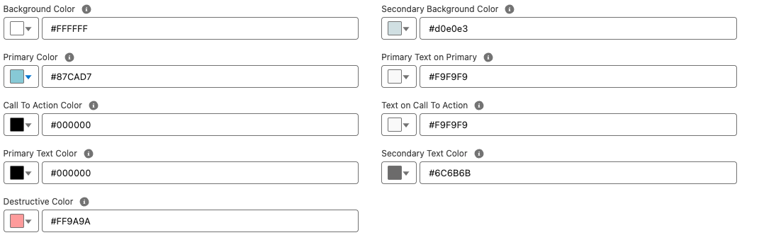
Color Usage
The table below describes how each configurable color is used within the frontend UI.
|
Color |
Explanation |
|---|---|
|
Background Color |
The main background color of the user interface. |
|
Primary Color |
The primary brand color used for key interactive elements such as links, toggles, and highlights. |
|
Call To Action Color |
Used to highlight key actions, such as Next, Submit, and Pay buttons. |
|
Primary Text Color |
The main text color used throughout the UI. |
|
Destructive Color |
Used for error states, such as input validation messages. |
|
Secondary Background Color |
Used for secondary surfaces, such as selection cards. |
|
Primary Text on Primary |
Text color displayed on top of primary-colored backgrounds. |
|
Text on Call To Action |
Text and icon color displayed on call-to-action buttons. |
|
Secondary Text Color |
Used for supporting or less prominent text, such as hints or descriptions. |
This configuration allows you to fully customize the look and feel of the frontend while maintaining clarity, accessibility, and brand consistency.
Per-step Configuration
Each step provides a set of layout options that can be configured individually on a per-step basis. This allows you to tailor the appearance and behavior of each step to its specific purpose within the booking flow.
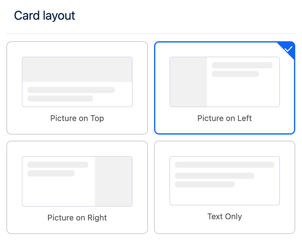
Card Layout
Steps that are based on user selection such as Blueprint Selection, Parent Resource Selection and Dimension Selection support customization of the card layout.
The card layout defines how selection cards are displayed to the user, enabling you to adjust their structure and presentation to better match your design requirements.
Card Data Fields
You can configure which Salesforce fields are used to populate the content displayed on selection cards. This allows you to control exactly which information is presented to the user for each selectable item.
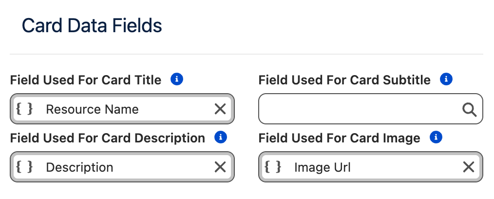
|
Card Element |
Purpose |
|---|---|
|
Title |
The main title displayed on the card. |
|
Subtitle |
Secondary text displayed between the title and the description. |
|
Description |
Descriptive text shown on the card. |
|
Image |
A URL pointing to an image that will be displayed on the card. |
If no field is specified for a Card Element, that element will not be rendered on the card.
Images are an exception: if no image field is configured, an empty image placeholder will be displayed. If you do not intend to display images on selection cards, it is recommended to use the Text Only layout to avoid empty placeholders.
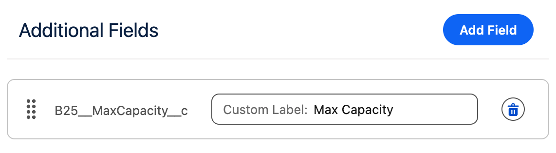
Additional Fields
In addition to the main card elements, you can configure additional fields to be displayed below the card description.
-
Each additional field is rendered on its own line.
-
The label associated with each additional field can be customized.
This allows you to add extra contextual information without overcrowding the main card content.
Card Settings
This section allows you to customize the size of the cards and their individual elements.
|
Setting |
Purpose |
|---|---|
|
Max Image Width |
The maximum width the image can occupy within the card. |
|
Cards Per Row |
The maximum number of cards displayed in a single row. |
|
Min Card Width |
The minimum width a card is allowed to have. |
Responsive Behavior
The Cards Per Row and Min Card Width settings are closely related. The Frontend Builder uses a fully responsive layout to ensure content is displayed clearly and elegantly across all screen sizes and container widths.
If there is not enough horizontal space to meet both constraints, the system will automatically reduce the number of cards per row.
On mobile devices, the layout automatically switches to Picture on Top to ensure an optimal viewing and interaction experience.
Example:
-
Cards Per Row:
2 -
Min Card Width:
700px -
Available container width:
1000px
In this case, only one card per row will be displayed, as two cards with a minimum width of 700px cannot fit side by side within the available space. To display two cards per row, either the container width must be increased or the Min Card Width must be reduced.
Max Image Width Guidelines
The Max Image Width setting controls how much horizontal space the image occupies within the card.
-
The value cannot exceed the configured Min Card Width.
-
Choose a width that leaves enough space for textual content, so the card does not appear visually constrained.
-
This setting also indirectly controls the image aspect ratio:
-
Smaller widths are better suited for portrait images.
-
Larger widths are better suited for landscape images.
-