
Displays a vertical day calendar designed for phones and tablets. It can show a single record, several records together in one column, or several records side by side as columns.
This component is available for app pages, home pages, record pages and Experience Cloud pages. It works in the Salesforce mobile app, in Lightning Experience and in Experience Cloud. Because it is compact, it also works well as a small calendar on desktop pages. See this article for more information on how to Add a Calendar to a page.
Display modes
What the calendar shows depends on the record type of the selected Calendar record and on where the component is placed.
|
Mode |
When |
What users see |
|---|---|---|
|
Single record |
The component is on a record page, or Allow selecting multiple records is off. |
One day column for one record. On an app page, users choose the record with a lookup at the top of the calendar. |
|
Several records in one column |
Allow selecting multiple records is on and the calendar is of record type |
One day column with the reservations of all selected records. |
|
Columns |
Allow selecting multiple records is on and the calendar is of record type |
One column per selected record, side by side. |
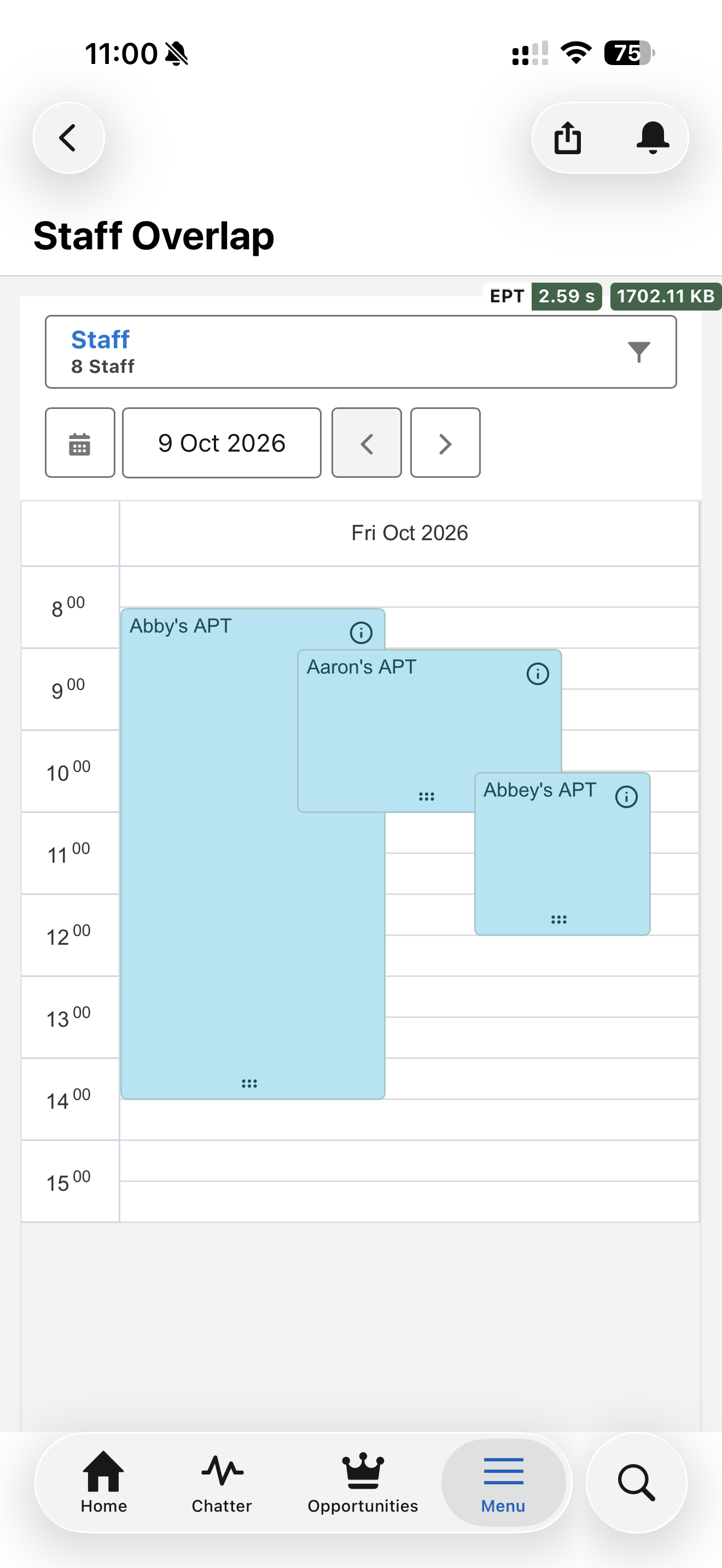
Several records in one column
Mobile users get an overview of the day without switching between records.
-
Overlapping reservations are shown side by side.
-
Each reservation shows which record it belongs to.
-
When users tap an empty slot to create a reservation, they choose which record the new reservation is for.
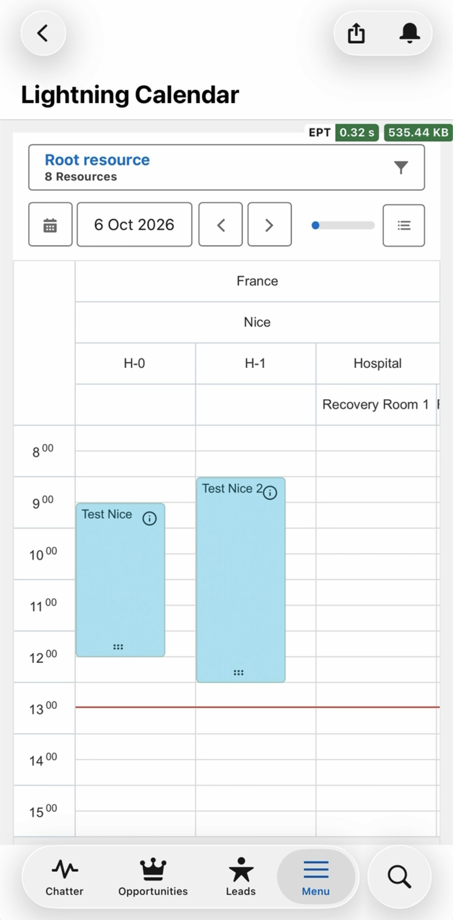
Columns
Each selected record gets its own column, for example one column per meeting room or per staff member.
-
A phone shows up to 3 columns at a time, a tablet or desktop up to 8. Users swipe left and right to reach the other columns.
-
When not all columns fit, a position bar in the header shows which part of the columns is in view. The list button next to it opens Go to a column, a searchable list of all columns, so users can jump straight to one.
-
If the calendar uses Dynamic Dimension Grouping with a hierarchical grouping, the columns are grouped under their parents, as on the other calendars. A selected record that contains other selected records becomes a group header and does not show reservations of its own.
Choosing which records to show
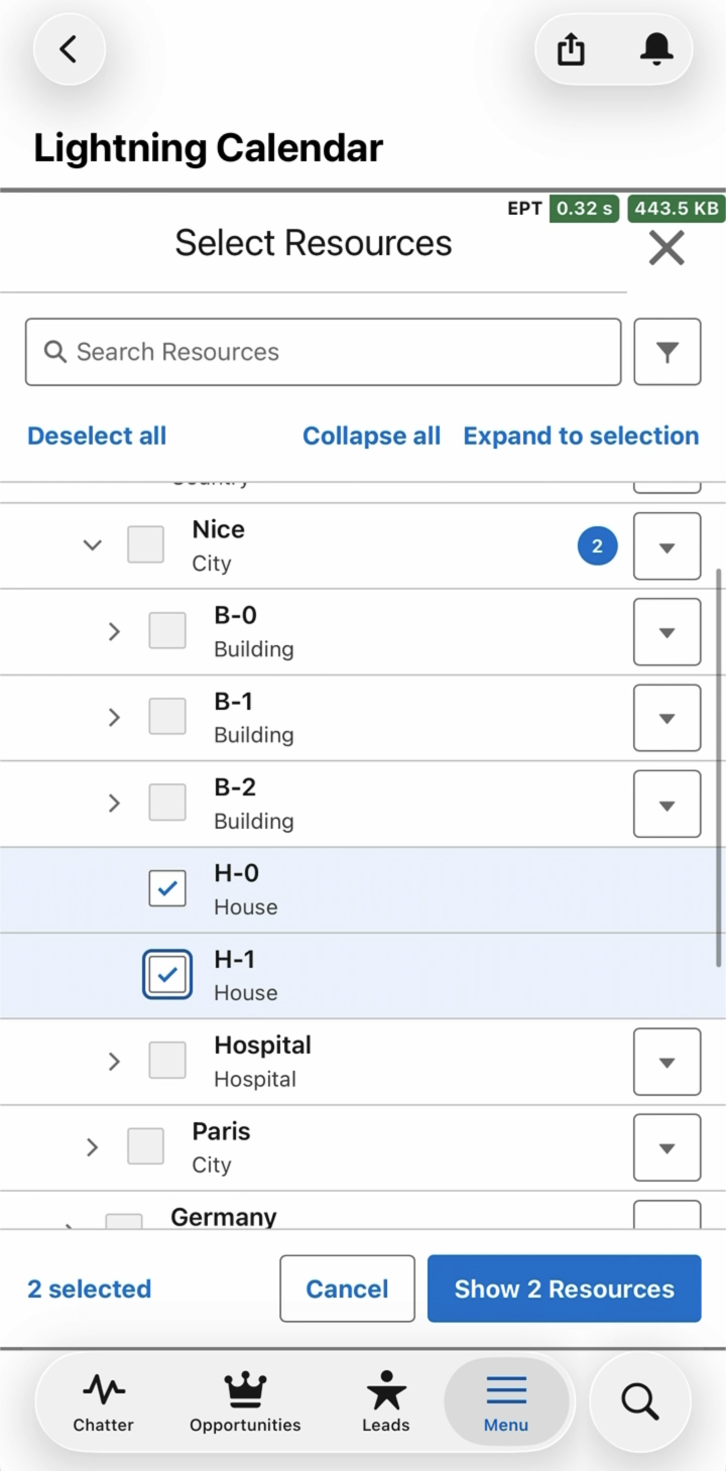
When Allow selecting multiple records is on and the component is not on a record page, users choose the records with a picker instead of a lookup.
-
For Resources, the picker follows the resource hierarchy, for example city, building, floor and room. Users can expand and collapse the levels, and selecting a parent selects the records inside it.
-
Users can search by name and filter on Resource type.
-
Users can show up to 50 records at the same time.
-
The last selection is remembered per calendar and per user, so the same records are shown the next time the user opens the page.
When nothing has been selected yet, the calendar asks the user to choose which records to show. You can set a Parent resource ID to show that resource's children instead (see below).
Properties
General Properties
|
Property |
Required |
Description |
|---|---|---|
|
Calendar |
Yes |
The component takes its configuration from the selected Calendar record. Views are ignored: the Mobile Calendar always shows a day view. Use a calendar of record type |
|
Allow selecting multiple records |
No |
Lets users pick several records with the picker. Column calendars show one column per record; other vertical calendars show the records together in one column. Has no effect on record pages, where the calendar shows the current record. Default: off. |
|
Parent resource ID (optional) |
No |
Only for Resource calendars with Allow selecting multiple records on. The ID of the resource whose children are shown on a user's first visit. Users cannot browse above this resource in the picker. The ID must be a valid Resource ID; otherwise the calendar shows an error. |
Controlling what the calendar displays
On an App Page or Home Page
-
With Allow selecting multiple records off, users choose one record with the lookup at the top of the calendar.
-
With Allow selecting multiple records on, users choose records with the picker. On a first visit the calendar shows the children of the Parent resource ID if one is set, and otherwise asks the user to choose.
On a Record Page
The calendar shows the reservations of the current record. The lookup and the picker are not shown.
In Experience Cloud
The component is available in Experience Builder with the same Calendar, Allow selecting multiple records and Parent resource ID properties. Make sure your site users have access to the records and reservations they need to see. See GoMeddo in Experience Cloud.
Showing the component on mobile only
In the Lightning App Builder you can set component visibility per form factor. If you want the Mobile Calendar on phones only, and a Vertical or Horizontal Calendar on desktop, add both components and set a Form factor visibility filter on each.
Differences from the other calendars
Compared with the Vertical Calendar and the Horizontal Calendar:
-
Users cannot use filters.
-
Users cannot switch between views; the day view is the only view.
-
Hovers are shown when tapping the info icon on a reservation.
-
Users change the length of a reservation with the resize handle at the bottom of the reservation.
Wrapping the Mobile Calendar
You can wrap the component in your own Lightning Web Component or Aura component, for example to pass the IDs of the records to show or to prefill fields on new reservations. See Wrapping Calendar Components - LWC and Wrapping Calendar Components - Aura.