This step allows the user to select a Blueprint (the type of appointment to be booked).
If you do not want this step to be displayed, you can pre-populate the Blueprint. When a Blueprint is pre-selected, this step is automatically hidden and skipped.
This step is available only in Reservation mode.
Step Configuration
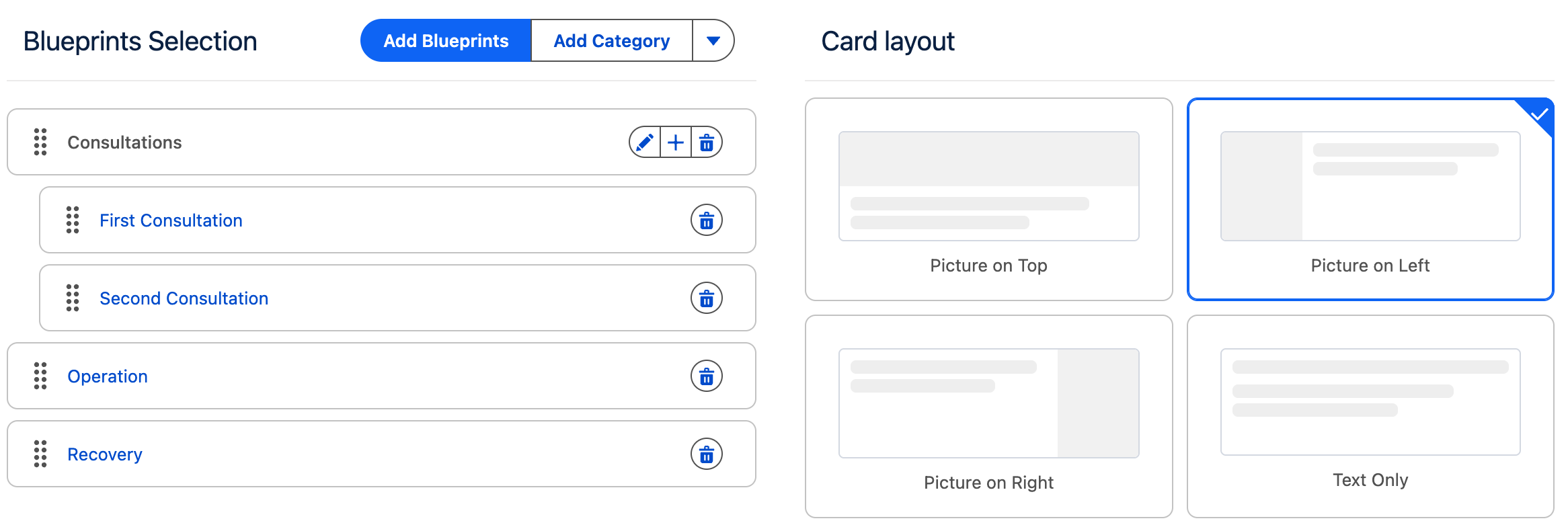
Blueprints Selection
This section allows you to define which Blueprints the user can choose from.
Blueprints can be organized in three different ways:
-
Categories only
All Blueprints are grouped into one or more categories. -
Standalone Blueprints only
Blueprints are displayed directly, without categories. -
Categories and Standalone Blueprints
Categories and standalone Blueprints are displayed at the same level, allowing you to mix both approaches. Blueprints associated to a category will be shown under that category.
Managing Categories and Blueprints
-
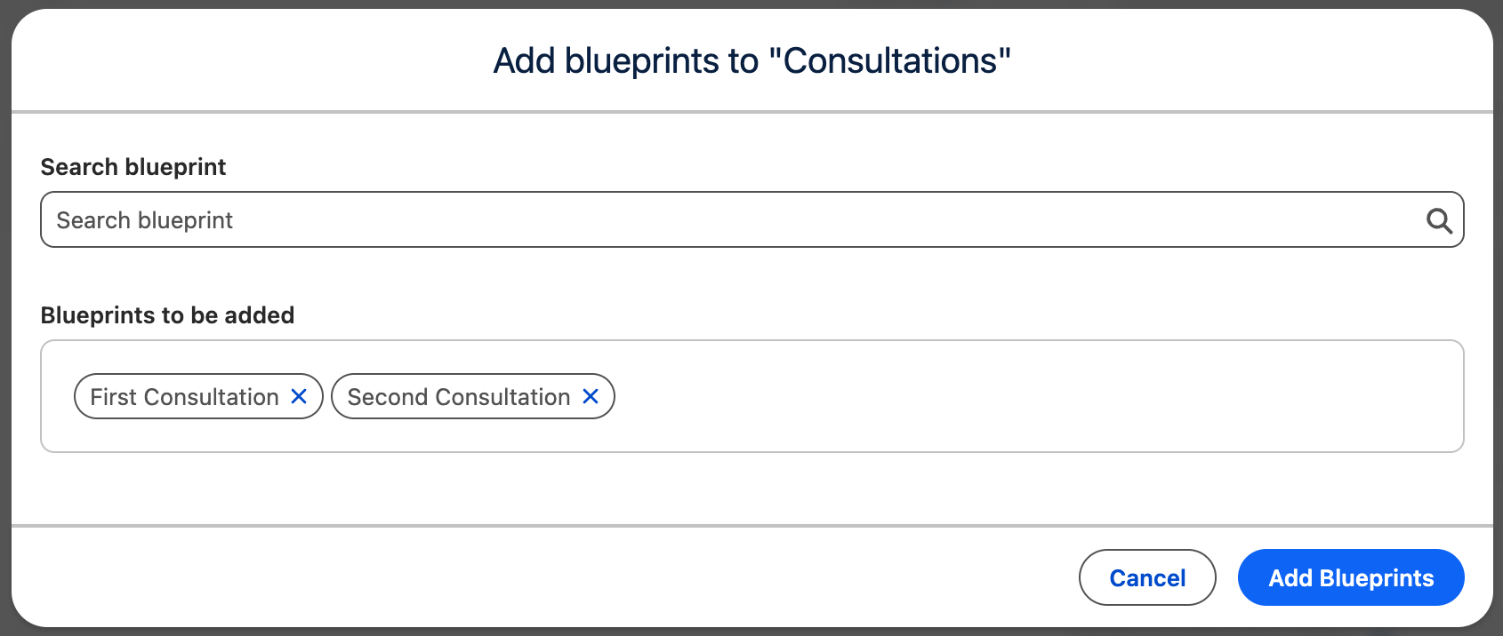
Categories can be added by clicking the Add Category button.
-
Blueprints can be added by clicking the Add Blueprint button.
-
You can also add Blueprints directly to a specific category by clicking the + icon on that category.
Ordering
Categories and Blueprints can be reordered using drag and drop via the drag handle.
The order defined in the configuration is reflected exactly in the frontend, allowing you to control how options are presented to users.
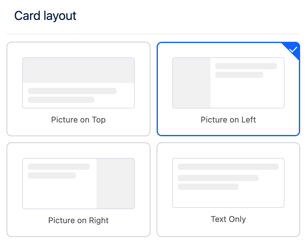
Layout Configuration
Card Layout
Steps that are based on user selection such as Blueprint Selection, Parent Resource Selection and Dimension Selection support customization of the card layout.
The card layout defines how selection cards are displayed to the user, enabling you to adjust their structure and presentation to better match your design requirements.
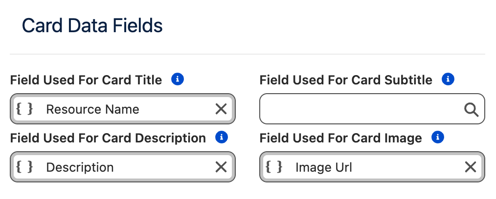
Card Data Fields
You can configure which Salesforce fields are used to populate the content displayed on selection cards. This allows you to control exactly which information is presented to the user for each selectable item.
|
Card Element |
Purpose |
|---|---|
|
Title |
The main title displayed on the card. |
|
Subtitle |
Secondary text displayed between the title and the description. |
|
Description |
Descriptive text shown on the card. |
|
Image |
A URL pointing to an image that will be displayed on the card. |
If no field is specified for a Card Element, that element will not be rendered on the card.
Images are an exception: if no image field is configured, an empty image placeholder will be displayed. If you do not intend to display images on selection cards, it is recommended to use the Text Only layout to avoid empty placeholders.
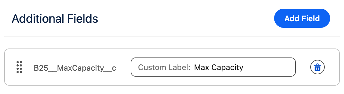
Additional Fields
In addition to the main card elements, you can configure additional fields to be displayed below the card description.
-
Each additional field is rendered on its own line.
-
The label associated with each additional field can be customized.
This allows you to add extra contextual information without overcrowding the main card content.
Card Settings
This section allows you to customize the size of the cards and their individual elements.
|
Setting |
Purpose |
|---|---|
|
Max Image Width |
The maximum width the image can occupy within the card. |
|
Cards Per Row |
The maximum number of cards displayed in a single row. |
|
Min Card Width |
The minimum width a card is allowed to have. |
Responsive Behavior
The Cards Per Row and Min Card Width settings are closely related. The Frontend Builder uses a fully responsive layout to ensure content is displayed clearly and elegantly across all screen sizes and container widths.
If there is not enough horizontal space to meet both constraints, the system will automatically reduce the number of cards per row.
On mobile devices, the layout automatically switches to Picture on Top to ensure an optimal viewing and interaction experience.
Example:
-
Cards Per Row:
2 -
Min Card Width:
700px -
Available container width:
1000px
In this case, only one card per row will be displayed, as two cards with a minimum width of 700px cannot fit side by side within the available space. To display two cards per row, either the container width must be increased or the Min Card Width must be reduced.
Max Image Width Guidelines
The Max Image Width setting controls how much horizontal space the image occupies within the card.
-
The value cannot exceed the configured Min Card Width.
-
Choose a width that leaves enough space for textual content, so the card does not appear visually constrained.
-
This setting also indirectly controls the image aspect ratio:
-
Smaller widths are better suited for portrait images.
-
Larger widths are better suited for landscape images.
-